Brochure
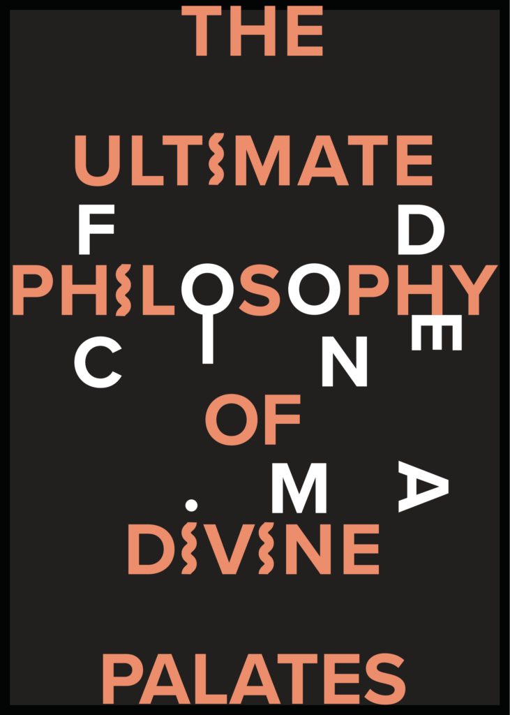
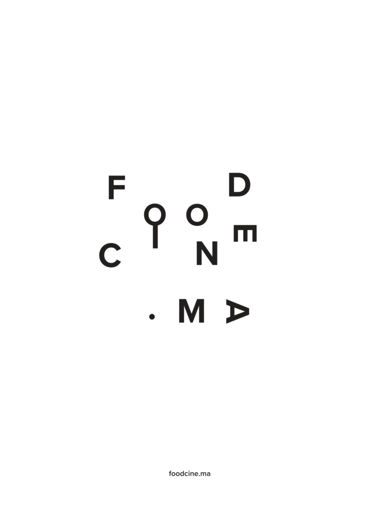
Being given the option of designing a poster for any event, I decided on a local food film event, the Foodcine.ma. The branding for this event is simple where it using the typeface ‘Optima’ with 2 basic colours, black & white. Wanting to stick to their simple branding, I decided not to use any graphics and play with the same typeface to give it a quirky personality. The title ‘The Ultimate Philosophy of Divine Palate’ allows the audience to know what FoodCine.ma is about. Using a faded red has helped the title stand out yet blend in with the other key elements simultaneously. I also bold the title to make it more noticeable and differentiate itself from the other details of the event. To fit the name “Foodcine.ma” in the poster, I layered it over the title. Using the 2 alphabets ‘O’ & ‘H’ from the word ‘Philosophy’ together with ‘I’ & ‘E’ from the logo, it formed a fork and spoon. I also changed the ‘I’ in the title to a wavy line to resemble noodles. This not only helps to accentuate the fact that the event is a food film but also gives it a quirky personality.
Programs used: Adobe InDesign, Adobe Photoshop


